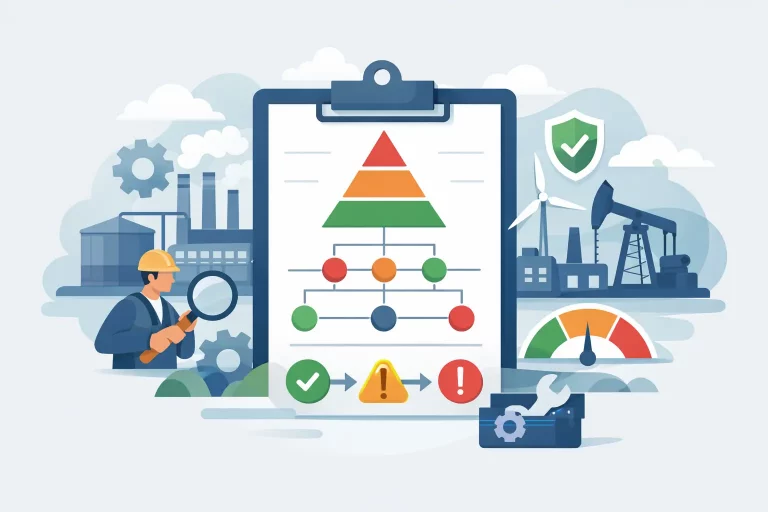
Build a Maintenance KPI Reporting Dashboard

When a maintenance leader says reporting is “fine,” what that usually means is someone can export a spreadsheet at the end of the month. That is not the same as having a maintenance KPI reporting dashboard that helps supervisors manage today, managers spot drift this week, and executives understand operational risk this quarter.
A useful dashboard does more than display numbers. It turns CMMS or FSM activity into operational direction. It shows whether preventive maintenance is actually happening, whether labor is being used where it should be, whether backlog is healthy or dangerous, and whether asset reliability is improving or getting buried under reactive work.
What a maintenance KPI reporting dashboard should actually do
Most dashboards fail for a simple reason. They are built around available fields, not operational decisions. The result is a screen full of charts that look impressive but do not help anyone run the business.
A strong maintenance KPI reporting dashboard should answer a few very specific questions. Are we doing the work we planned? Are technicians using time effectively? Are assets becoming more reliable? Are urgent failures consuming the schedule? Are certain sites, shifts, or teams operating outside standard expectations?
That means the dashboard is not just a reporting layer. It is a management tool. It should support daily execution, weekly review, and monthly accountability without forcing every audience to read the same metrics in the same way.
For a planner or supervisor, detail matters. For an operations leader, trend lines and exceptions matter more. For finance or executive leadership, the dashboard should connect maintenance performance to downtime exposure, labor efficiency, vendor use, and service delivery risk. If one dashboard tries to serve all of them without structure, it usually serves none of them well.
Start with the decisions, not the visuals
Before choosing charts, define the operating decisions the dashboard should support. This is where many organizations skip ahead and create noise.
If your biggest issue is reactive overload, then planned versus unplanned work, PM compliance, emergency work volume, and schedule attainment should be front and center. If the bigger problem is poor technician execution or weak CMMS discipline, then completion quality, status aging, labor coding accuracy, and closure timeliness matter more. If leadership is struggling with multi-site visibility, then the dashboard needs normalized metrics across locations, not site-specific workarounds.
This is also where trade-offs come into play. Not every KPI belongs on the main screen. A dashboard overloaded with twenty metrics usually hides the five that actually drive performance. Keep the top level focused on signals. Use supporting views for drill-down, root cause analysis, and exception tracking.
The core KPIs that belong on most dashboards
There is no universal template, but most maintenance organizations need a common foundation. PM compliance is one of them, provided it is defined correctly. A PM marked complete three weeks late should not be treated as success. Schedule compliance also matters because it shows whether teams are executing the plan they committed to.
Reactive versus planned work is another essential measure. If most labor hours are going to emergency or break-fix work, your maintenance model is unstable regardless of how many work orders get closed. Backlog is equally important, but only if you segment it by age, priority, and labor hours. A single backlog number can be misleading. Fifty low-priority cosmetic tasks and fifty overdue safety-critical work orders are not the same operational problem.
Labor utilization deserves careful treatment. Leaders often ask for wrench time, but many organizations do not have the data discipline to calculate it credibly. In those cases, scheduled hours versus completed hours, travel time, indirect time, overtime, and technician capacity by shift may be more actionable. Mean time between failure and mean time to repair can be useful for critical assets, but they are often poor enterprise-wide metrics when failure definitions are inconsistent.
A good dashboard also includes data quality indicators. If work orders are missing failure codes, labor entries, asset references, or completion notes, the dashboard should show that. Bad data is not a reporting issue. It is an operating issue because it limits planning, reliability analysis, and accountability.
Why many dashboard projects fail
The technology is usually not the real problem. The bigger issue is that the underlying process is weak.
If technicians are inconsistent in status updates, your backlog view will be distorted. If planners are not using standard priority rules, urgent work reporting will be unreliable. If asset hierarchies are messy, reliability metrics by system or location will be compromised. If closeout discipline is poor, your PM compliance may look healthy while completion quality is actually weak.
This is why dashboard design should never be separated from workflow design. Reporting reflects execution. It does not fix it on its own.
Another common failure point is metric definition. Teams say they want schedule compliance, but one manager defines it by work order count and another by labor hours. One site includes carryover work and another excludes it. By the time the numbers reach leadership, everyone is arguing over logic instead of managing performance.
The fix is straightforward, even if it takes discipline. Standardize definitions, standardize status usage, standardize closeout requirements, and standardize how work types are coded. Then build reporting on top of that structure.
How to structure the dashboard for different levels of management
The best dashboard designs separate operational control from executive visibility.
Daily and weekly management view
This view should help frontline leaders run the work. It typically includes open work by priority, overdue PMs, schedule compliance, technician assignment load, aging work orders, and exceptions that require immediate action. It should make bottlenecks obvious. If one site has a rising emergency queue or a planner has too much unassigned work, the dashboard should surface that quickly.
Monthly performance view
This is where trends matter more than daily fluctuation. Month-over-month PM completion, reactive labor share, backlog age, overtime, vendor spend, repeat failures, and closure quality are often more valuable here. This view should support accountability reviews, not just retrospective reporting.
Executive view
Senior leaders do not need every work order count. They need a clear picture of reliability risk, labor effectiveness, compliance exposure, service responsiveness, and whether the maintenance function is becoming more planned and predictable. If the dashboard cannot connect KPIs to business impact, it will be treated as departmental reporting instead of operational intelligence.
Build for behavior, not just visibility
The dashboard should change how people act. That means every KPI should have an owner, a review rhythm, and a response expectation.
If PM compliance drops below target, who investigates and by when? If backlog age rises at one site, what threshold triggers intervention? If emergency work spikes, what root causes are reviewed? Without these management rules, the dashboard becomes passive. People look at it, discuss it, and move on.
This is where many organizations need more than reporting support. They need operating discipline. Eficiqo often sees environments where the system can produce data, but the organization has not established the routines that turn data into action. A dashboard is only as strong as the review cadence behind it.
Data model and system realities matter
CMMS and FSM platforms vary widely in reporting maturity. Some support flexible dashboards out of the box. Others require substantial cleanup, custom logic, or external reporting layers. That does not mean you should wait for a major system overhaul before improving reporting.
It does mean you should be realistic. If your work order data is inconsistent across sites, start with a smaller set of trusted KPIs and improve adoption in parallel. If labor capture is weak, do not build executive dashboards around labor efficiency claims you cannot defend. If asset criticality is not defined, be careful with reliability segmentation.
A phased approach is usually stronger than a big-bang rollout. Start with foundational KPIs, lock down definitions, validate the data, train managers on review habits, and expand once the basics are stable.
What good looks like
A strong maintenance KPI reporting dashboard is clear, disciplined, and tied to action. It does not try to impress people with visual complexity. It tells the truth about the operation, including uncomfortable truths about adoption gaps, planning weakness, or reactive overload.
More importantly, it creates alignment. Supervisors know what to address today. Managers know what trends need intervention. Executives can see whether maintenance performance is protecting uptime or creating risk.
If your current dashboard mostly reports activity after the fact, that is the opportunity. The goal is not more charts. The goal is a reporting structure that helps your team plan better, execute with more consistency, and manage performance before small issues become expensive ones.
The right dashboard should make the next operational decision easier, faster, and harder to ignore.